Tips for Designing the Best Roller Banner
When it comes to advertising your business at events and exhibitions, roller banners are a cost-effective signage solution that will help you attract more leads and showcase your brand. However, this all hinges on the design which is why we’ve put together five tips for designing the best roller banner.
Identify Your Banners Purpose
Before you put any thought into the design of your roller banner, you need to identify its purpose. Are you wanting to drive sales, are you wanting to boost brand awareness or promote your brand?
It’s also worth thinking about where your roller banner will be displayed. Are you taking it to a specific event or perhaps it will sit behind you during zoom meetings?
Having a clear idea as to why you want a roller banner will help you determine the route to go with the design. That could be something as simple as adding your logo and brand colours or creating a roller banner that that is a little more text heavy and includes imagery of key products.
Place Your Logo at the Top
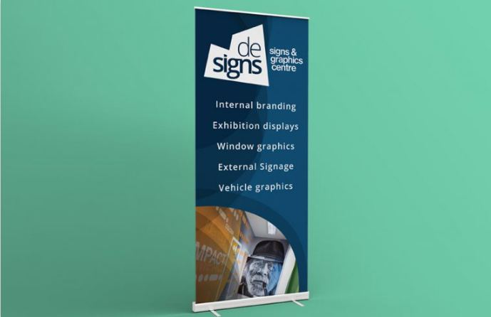
The top of your roller banner is considered prime real-estate, why? Because it’s usually the first-place viewers look when reading your roller banner. This is why it’s important to put your company logo at the top. The first thing you want viewers to know is who you are and what your business does.
Focus on One Key Message
It can be tempting to overload your roller banners with multiple messages, especially if you’re advertising at trade shows or exhibitions. You want to tell your target audience about everything you do, but this is a mistake. This can confuse your audience and clutter your signage so focus on one key message per roller banner.
Think Left to Right
The natural way to read anything is from left to right, top to bottom. This is the same for roller banners too. When adding text, imagery, and graphics to your roller banner, think carefully about the placement and overall layout. Getting the layout wrong can affect how your message is read by your target audience.
Stand Out with Colour
Colour is one of the best tools to help your roller banner stand out from your competitors at events and exhibitions. Colour is one the best ways to reinforce brand recognition and brand awareness.
Whatever colours you decide to use need to be on brand and enhance the design of your roller banner. Use colours that complement each other and contrast well against any text or graphics.
Readability is Key
Once you know what message you want to add to your roller banner, you need to ensure it is easy to read. The biggest mistake people make when designing roller banners is using text that is either too small, the wrong colour or is in a hard to read font.
Not only is the font an important part of readability, but so is text spacing. It’s important that you leave, what they call in the industry, white space. This is clear space left around logos, graphics, imagery, and text. Using white space successfully can makes the content on your roller banner design easily scannable and significantly improves legibility.
Include Your Contact Information
Don’t forget to add your contact details to the bottom of your roller banner, especially if you’re planning on taking it to events or exhibitions. At events, you might not get the chance to speak to every attendee who visits your stand, which could mean a potential lead lost. Including your contact information means potential customers know the best way to get in touch with you, where that’s via your website, emailing you or picking up the phone.
Thank your reading our latest blog! If you need help designing a quality roller banner, De-Signs is here to help. Please don’t hesitate to get in touch with our friendly design team on 01423 873 555, or get a quick quote.